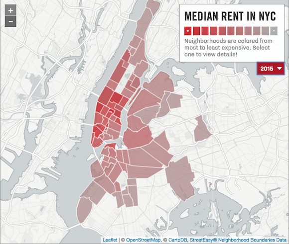
You know what we don’t have enough of? Maps. Especially maps that show rent. We do not have nearly enough rent maps. Where are all the rent maps? Just kidding, obviously. We have all the rent maps. Including this latest map by Curbed NY, which color-codes the evolution of New York City and Brooklyn rent using StreetEasy rent data collected since 2009.
The results are unsurprising, but they do give you a fun and interactive way to muse about the day you will be priced out of your neighborhood and move to Connecticut.
Using this map you can watch as, year by year, Williamsburg gets more expensive, going from $2,500 in 2009 to $3,099 in 2015. But hey, that’s one dollar cheaper than it was in 2012 ($3,100)!
You can also click through the years to watch East New York suddenly pop up onto the map as becoming more expensive than the median—probably because someone named it the “next frontier,” right?
The general caveat of median-rent trolling is that there’s no information about how many bedrooms there were in each census-ed unit. I mean, we’re assuming you only get one bedroom for your $2,500 in Williamsburg. Which is deeply depressing. But it is kind of fun to watch things turn a “brilliant red,” even if the red is foreshadowing for the day we all pay our rent in blood when we can’t afford it in dollars anymore.
Become fit for survival, sign up for our weekly email!
Related Articles

Get groovy at the Greenpointers Flower Power Spring Market (Sun, April 7th)
The not-to-be-missed Greenpointers Flower Power Spring Market is this Sunday on the Brooklyn waterfront.

Celebrate St. Patrick’s Day with Drinks Specials & Free Food on Grand St! (Sunday, 3/17)
This SUNDAY (March 17), 13 bars along Grand Street celebrate St. Patrick’s Day with 29 drink specials and free food. This 8th edition of the Grand Street BID annual Pub Crawl makes you Sunday Funday easy – walk or stumble along just 6 blocks to eat and drink to your lucky charm’s desire. (ad)

NYC Battles Fatberg Epidemic
The fatberg phenomena is taking Brooklyn sewers by storm.
Leave a Reply