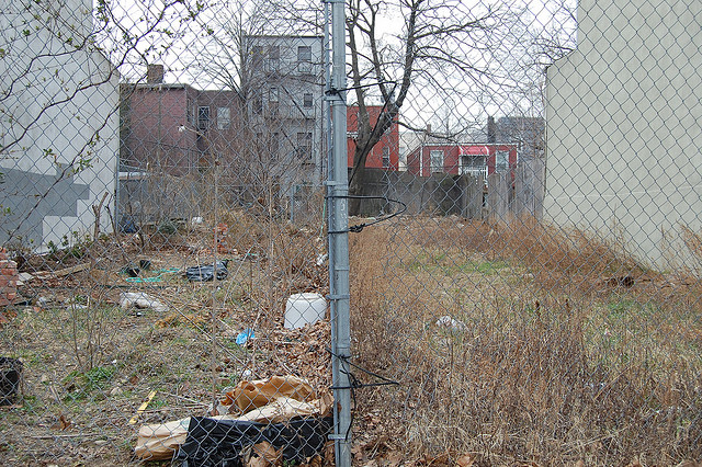
There are few things we appreciate more than cool interactive features and complaining about rent. We’re pretty riled up right about now thanks to a map that confirms all your suspicions that the rent is in fact too damn high. It’s all thanks to a map that Curbed released, via StreetEasy, today that reminds us all Brooklyn is the least affordable borough in the city and that rent is outpacing income like it’s The Flash and our paychecks are regular humans.
While the average rent-to-income ratio in the city is 58 percent–ridiculously high compared to the 30 percent people should probably be aiming for–North Brooklyn has some of the most staggering numbers. The rent to income ratio in Williamsburg is 86.5 percent and it’s 89.1 percent in Red Hook. It’s kind of baffling how this is actually possible, but we’re guessing it has a lot to do with the city’s growing income inequality.

There’s still hope in southern Brooklyn though; people in Gravesend actually have a lower rent to income ratio than the usual 30 percent, at 19.7 percent. With the exception of Bath Beach, most neighborhoods down there have ratios below 40%, but considering how steadily the effects of gentrification are creeping southward, we’re curious how many of these spots will be as affordable a year from now.
Related Articles
Brooklyn’s Wegmans will open October 27th, hiring now
Wegmans, the upstate New York-based grocery store will open its first Brooklyn location this fall.

Get groovy at the Greenpointers Flower Power Spring Market (Sun, April 7th)
The not-to-be-missed Greenpointers Flower Power Spring Market is this Sunday on the Brooklyn waterfront.
Apply for the NYC affordable housing lottery at these Brooklyn buildings
A number of new Brooklyn buildings currently have “affordable” units to apply for under the NYC housing lottery.
3 Comments
Leave a Reply
UGH I AM SO TIRED OF SAD MAPS.
LET’S USE THIS ONE INSTEAD: http://timvandevall.com/app/uploads/2013/09/Pirate-Treasure-Map.jpg
For the ratio that it’s calculating, I think it’s comparing the median asking rent for apartments on the market to the median income in the neighborhood. This doesn’t factor in continuing existing leases.
It doesn’t mean that in Red Hook, half the people are spending over 89% of their income on rent. It means that the median rent for apartments on the market are incredibly unaffordable for most people who already live there.
Not saying the ratios are fine, since it’s definitely a display of income inequality and gentrification, but I think Curbed is misleading the reader by saying “here’s the percentage of income that a typical New Yorker is putting towards rent,” because that does seem unbelievable.
The reason the numbers seem so insane is because they’re comparing asking rents for new leases, not rents that people are currently paying. About half of current leases in NYC are rent stabilized, so those people are paying significantly lower rents compared to what the market is asking for. Similarly, new leases don’t take into account the low rents people pay in NYCHA public housing. Finally, there’s a glut of new luxury rental buildings going to market for the first time. Their asking rents would bring the average way up.
IMO, what this shows is just how unequal these neighborhoods are becoming, in terms of who is living there currently, and who can afford to move there now.