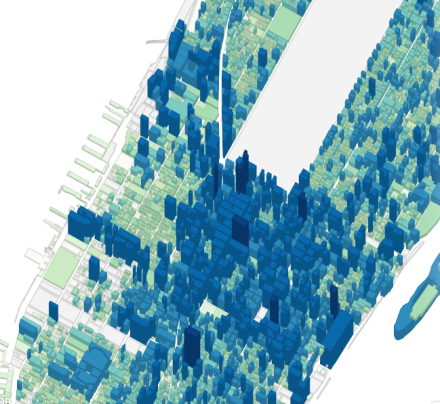
Tax return season may be over, but that doesn’t mean you can’t still reap the fun, fun, fun benefits of tax lot data! The PLUTO dataset takes tax lot level data from the NYC Department of Finance Tax. Programmer Andrew Hill took that data and turned it into interactive maps. Combining history, geography, and curiosity, Hill tells the story of when, where, and how New York was built – and how many flights of stairs had to be climbed to get there.
As with anything, some clicks are more exciting than others. One map will tell you how many residential units are packed in per tax lot (surprise: we are all living very close to each other), while the next will draw the island of Manhattan as a landscape not of sidewalks and stories, but peaks and valleys.
Other contrasts include identifying the zoning laws that dictate where Brooklyn must stay low (no jerkface condos here!), and exactly how high the highest walk-ups in the city go (up to 16 stories).
We don’t wanna spoil the rest for you, so check it out for yourself, and the next time you gripe over doing your taxes, remember that you might just be contributing to the cool-ass, time-sucking, interactive 3D map of the future.
Related Articles

Brooklyn’s Wegmans will open October 27th, hiring now
Wegmans, the upstate New York-based grocery store will open its first Brooklyn location this fall.

Get groovy at the Greenpointers Flower Power Spring Market (Sun, April 7th)
The not-to-be-missed Greenpointers Flower Power Spring Market is this Sunday on the Brooklyn waterfront.

Apply for the NYC affordable housing lottery at these Brooklyn buildings
A number of new Brooklyn buildings currently have “affordable” units to apply for under the NYC housing lottery.
Leave a Reply