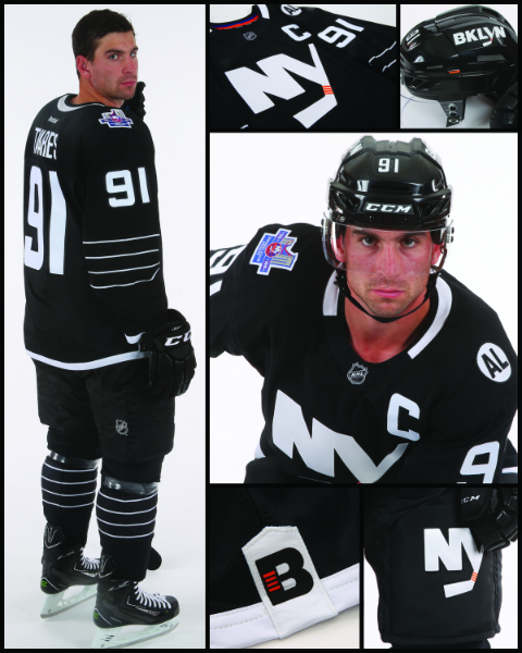
Hockey season starts soon, which is great news for the city’s Ranger fans. Oh, and the Islanders fans too we suppose, what with them being Brooklyn’s new home team. In order to make sure people are HYPED for the inaugural season of hockey at the Barclays Center, the Islanders just debuted their black and white alternate jersey. And it is…the jersey equivalent of a .500 season spent on the bubble and barely missing the playoffs.
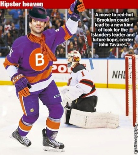
We mean, we’ll cop to not exactly making this a safe space for Islanders fans in the past, but this jersey is so boring it can’t even get our dander up for a good natured bit of ranting about how it’s ugly. Seriously, our eyes are over here yawning as we look at John Tavares up there trying to channel Wayne Gretzky rocking an early-90s Kings sweater. Aren’t we supposed to a young, exciting borough or whatever crap that’s being said to raise property values from Greenpoint to Marine Park? Why didn’t we just let the Post design the jersey?

Islanders, what happened? This used to be a franchise that took risks, whether it was putting the Gorton’s fisherman on your jersey or letting a financial fraudster buy the team. We can’t even get angry about the stupid way they spell “Brooklyn” on the helmet. It’s not like the colors black and white have anything to do with Brooklyn, beyond the Nets going with them as they desperately ran from their New Jersey past. This kind of “Let’s just do a thing that worked before” could almost inspire a thinkpiece on the corporatization of Brooklyn and giant multinationals trying to glom on to our edge but these jerseys are just so boring we’re falling asleep on our keyboard and don’t want to fall too deeply asleep and drool all over it.
Leave a Reply


