One of the reasons, probably the biggest reason, people not in New York hate New Yorkers is because of our incredible self-regard. In our opinion, we live in the best city in the country, if not on Earth, and our opinion about that is the only one that matters. So the news that it’s been scientifically determined New York City households have extremely low carbon footprints probably isn’t going to do anything about that incredible self-regard of ours. Eh, screw it. Suck it, rest of America!
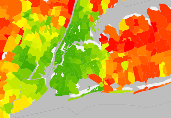
The University of California at Berkeley made a map out of a study called Spatial Distribution of U.S. Household Carbon Footprints Reveals Suburbanization Undermines Greenhouse Gas Benefits of Urban Population Density, that shows, well, that suburbanization undermines the greenhouse gas benefits of urban population density. All that green in New York City indicates that households around here give off between 30 and 40 metric tons of carbon dioxide per household. In the suburbs around here, and in not-New York City America, the red areas indicate households giving off 50, 60, 90 metric tons of carbon dioxide.
New York isn’t the only place in the country that comes up green in the map, but vast swathes of areas that consider themselves God’s America come up yellow and red in CO2 emissions. Of course, self-appointed spokesman for God’s America Erick Erikson has reacted to the idea of global warming thusly:
The difference between people who believe in the 2nd coming of Jesus and those who believe in global warming is that Jesus will return.
— Erick Erickson (@EWErickson) January 2, 2014
so this probably won’t do anything to change their habits with regard to density, or how they view New York City.
Related Articles

Brooklyn’s Wegmans will open October 27th, hiring now
Wegmans, the upstate New York-based grocery store will open its first Brooklyn location this fall.
Get groovy at the Greenpointers Flower Power Spring Market (Sun, April 7th)
The not-to-be-missed Greenpointers Flower Power Spring Market is this Sunday on the Brooklyn waterfront.
Apply for the NYC affordable housing lottery at these Brooklyn buildings
A number of new Brooklyn buildings currently have “affordable” units to apply for under the NYC housing lottery.
One Response to
Leave a Reply
Let’s be brutally honest here, New York IS the best city in the world. There’s no way to dance around that fact.