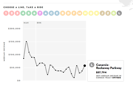
The subway is New York’s great equalizer. It’s the one place in the city that puts comfortable, monocled millionaires into the same tiny box with rude, possibly deranged people who clip their toenails in public. And those millionaires take the train, or at least pretend to, because the only thing more New York than being filthy monocle rich is pretending that you’re still a working class palooka despite your vast wealth. But now, thanks to the New Yorker, people will know just how rich you are when you get off the subway, because they’ll be armed with the median income of your subway stop.
Someone at the New Yorker who really loves infographics whipped up this awesome interactive chart that shows the median income of every stop of every subway line in the city. The richest subway stop? The Chambers Street 1,2 and 3, A and E stops, the World Trade Center E stop all have median incomes of $205,192. The poorest stop in the system is Sutter Ave on the L, coming in at $12,288. Brooklyn’s number one! It doesn’t necessarily teach you anything you didn’t already strongly suspect (Manhattan is rich, the Bronx is poor) but it’s fun to play with regardless, and could even put things in perspective for where you sit on the income inequality scale. For instance, I make well under the median income for my subway stop, which means I’m authentic!
Related Articles
Brooklyn’s Wegmans will open October 27th, hiring now
Wegmans, the upstate New York-based grocery store will open its first Brooklyn location this fall.
Get groovy at the Greenpointers Flower Power Spring Market (Sun, April 7th)
The not-to-be-missed Greenpointers Flower Power Spring Market is this Sunday on the Brooklyn waterfront.
Apply for the NYC affordable housing lottery at these Brooklyn buildings
A number of new Brooklyn buildings currently have “affordable” units to apply for under the NYC housing lottery.
One Response to
Leave a Reply
thanks for sharing…interesting article.
glad to know that i’m gentrifying flatbush ave 2/5 stop with my extra $500